
Text by Hannah Jones
As a new year begins, we welcome one of the most anticipated announcements in the design community: the Pantone Color of the Year. And this year, the famed color creator gave us a little surprise: two colors of the year! Ultimate Gray and Illuminating were chosen for 2021 to symbolize “a marriage of color conveying a message of strength and hopefulness that is both enduring and uplifting,”—a sentiment we can all agree with after 2020.

Two colors also open up an all-new realm of creative freedom for designers; incorporate both into a gorgeous and diverse design or stick with one and let your imagination run wild. But the question remains: what’s the best way to incorporate the two hues into your 2021 style scheme? To answer that, we consulted the experts: Mary Maydan, founder and principal of Maydan Architects, and Gala Magriñá, founder and principal of Gala Magriñá Design.
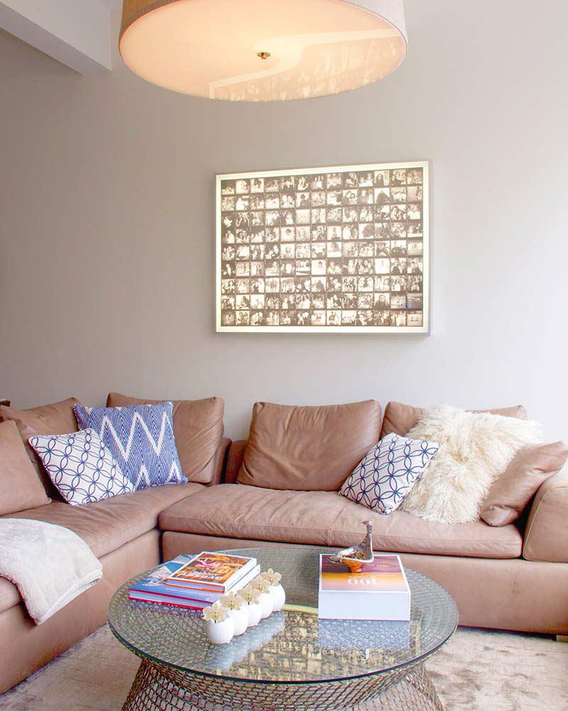
Depending on your color selection, incorporating the Pantone Colors of the Year can be using them as a base hue to anchor a space or as a playful accent. “Ultimate Gray has a presence without overwhelming a space,” Mary says. While working with Illuminating, however, she advices using it sparingly. “In most rooms, we recommend using bright colors, like Illuminating, moderately by incorporating a single furniture piece or accessories such as throws and pillows in that color.” Gala agrees, saying, “Personally, I feel like an entire room painted a bright color can be really overwhelming and suffocating, so I like to use it in small doses and then use furniture and décor accents to bring more color in. Ultimate Gray is neutral enough that it can be used to paint an entire room.”

Where to bring in the colors is another sought-after question. When working with Ultimate Gray, you have a little more leeway as it is a neutral shade, but Gala suggests thinking outside the box in addition to the usual setting. “Being more neutral, Ultimate Gray is great for a bedroom, living room, or kitchen. Gray is also making a big comeback for home exteriors as well,” she says. To keep a space lively when using the hue, both Mary and Gala suggest pairing Ultimate Gray with something brighter and more colorful or layering natural textures for warmth. “I recommend using the color with wood accents and other colors to make sure the space feels rich and textured and doesn’t feel too flat, which can happen with gray,” Gala says.

Despite its bold profile, Illuminating also has varied uses and settings. Mary suggests bringing the yellow hue into children’s rooms, noting its capability to be gender-neutral yet still cheerful and bright, while Gala advises adding Illuminating to rooms that need a more uplifting atmosphere. “Yellow is reminiscent of the sun which essentially gives us life, so it’s a wonderful color to bring into an office or breakfast room where you want to be energized and productive,” Gala says. Accents like wallpaper, furniture, and throw pillows are wonderful and cost-effective ways to bring the color into a space.

Both designers agree that the key to using both colors is balance, circling back to the sentiment behind Pantone’s choice. Gala says, “Illuminating is energizing, uplifting, and vibrant while Ultimate Gray is more grounding and stabilizing. In feng shui, gray represents metal. Too much gray in a room can lead to overanalysis and rigid thinking; however, just the right amount of gray, balanced with other colors, can be a great addition to any space.” And Mary notes that Illuminating might just be a little dose of cheer we all need at the start of this new year. “Illuminating is a pick-me-up color, just in time for the mood-lift we all need. Illuminating brings touches of warmth and vibrancy to a space. It adds playfulness and a feeling of youth and when used wisely can also be sophisticated and hip. It’s an incredibly versatile color that is always eye-catching,” she says.


